Beauty and defects of one of Alfons Mucha’s most complex works, a masterpiece that is waiting to be exhibited to the public again
The Slav Epic by Alfons Mucha, besides being one of the greatest works of art ever made by a Czech artist and perhaps also worldwide, has received a certain notoriety in recent years which is not due to its artistic value but more due to legal issues, and the need to display it permanently in one single location.
Leave it in Moravský Krumlov, after all it has been there since 1963. But Mucha gave it to Prague, we should find a place to put it there! But where do you place 20 paintings of 6 by 8 metres in dimensions? Let’s keep them at the National Gallery for a while, then we’ll see! There is also the grandson of the artist, John Mucha, who claims it for himself. Why don’t we take them on a trip to Asia, in order to take more time?
In a nutshell, this is the debate surrounding the cycle of 20 canvases, which are currently in the comfortable basements of the Prague Gallery awaiting placement. A debate, which erupted almost ten years ago, after the Epic had remained away from the general public for almost 70 years (in Moravský Krumlov actually), which does not seem to take into consideration the paintings themselves, but seems more linked to questions of prestige. However, the theme should also be addressed in light of what the work actually is.
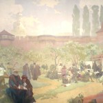
 Beyond the recent triumphalist presentations, which underline the grandeur of the work, seeing the Slavic Epic live, in addition to the admiration for such a grandiose work, leaves you with a few doubts. The overall sense is that some panels have an unquestionable technical value, while others appear to be watered down or too dark. This has nothing to do with the themes and episodes presented in the individual canvases. The cycle traces the history of the Slavs of pagan origins and marks their important moments, obviously with an eye turned to Czech history (10 canvases out of 20).
The perplexities however, must have been manifested even when Mucha, in 1929 and after 18 years of work, presented the work in Prague, where it was judged as anachronistic and did not enjoy any particular success. In fact, however, it was genuinely anachronistic, and this can be easily explained. In the first Czechoslovak republic the avant-gardes dominated, as in the whole of Europe. The currents in vogue in Prague were poetism, Dadaism and surrealism. The rediscovery of the Slavic roots had long since passed and the transformation of Russia into the Soviet Union had clearly slowed the idea of pan-Slavism. It was therefore logical that a work with a strong academic approach would not particularly provoke a stir.
The adequate time would have been that of the Národní obrození (the Czech National Revival). The time of the Austro-Slavism of František Palacký, of the elegies on the Princess Libuše from Julius Zeyer, and of Bedřich Smetana’s Má vlast. A period that ended at least 40 years earlier. It is no coincidence that the commissioner of the work was neither Czech nor Slovak, but an American fan of Slavic culture, Charles Richard Crane.
In addition to this, we must mention some of the technical and compositional limits of the author. We should remember that Mucha was above all a graphic designer; he made his posters with pastels and watercolors from which the lithographs were then produced. The Slav Epic, on the other hand, is made by combining tempera and oils, techniques to which Mucha was less accustomed and therefore could have been insidious even for an expert artist like him. We will discuss it further.
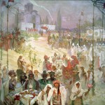
Many paintings of the epic have a similar composition, which is useful because it helps to give homogeneity to the cycle. A striking case is provided by two of the best canvases, namely “The Celebration of Svetovid on Rügen island” and “The Introduction of the Slavonic Liturgy in the great Moravia” (canvases 2 and 3 of the cycle). The composition is basically upside down. You find large human figures in the foreground on one side, smaller human figures on the other and buildings or naturalistic background elements. What makes the two pictures different more than anything is the religious-theme (first paganism, then Christianity). In these two pictures the work works wonderfully because Mucha was very good at managing tempera and oils. What went less well, for example, was “The Coronation of Stefan Dušan” (great king of the Serbian people, canvas number 6), where the use of colors is rather disorderly, and the overall effect is not very exciting.
In this regard, we should still remember “Master Jan Hus preaching at the Bethlehem Chapel” and “The Hussite King Jiří of Poděbrady” (panels 8 and 13). In this case the composition is particularly important because it links the paintings that represent the beginning and the end of the Hussite wars. The problem is that at other times we get the impression we are standing in front of the same canvas and instead we are dealing with three different paintings.
In any case, almost all the compositions are particularly elaborate, with different perspective plans, a large number of people and complex architectural-naturalistic-ornamental elements (because Mucha was a graphic designer, but also one of the leading exponents of Art Nouveau). This complexity, in order not to seem cheap or overly pompous, must be supported by a very skilled colour management, and as we said, the artist used a technique as ambitious as it was demanding for his epic.
The colours are colours based on water, oils, in fact, on oil. Just as water and oil do not mix, the combination of these elements also requires skill. It can be done, but you must be skilled.
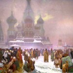
Mucha was indeed: he opted for a pragmatic technique, that is to say to make the upper parts (the sky and the backgrounds) with tempera, in order to give them a nuanced feeling. This brings out the oils in the foreground more, which are also glossier and dominate the scene. In some cases, the result was excellent, in others less so. The best case seems to be “The abolition of serfdom in Russia” (canvas 19), in which people “pierce the canvas” in front of the misty St. Basil in the background, and the image has a very good “3D” sense. Other times the result is canvases that are decidedly too “temperate”. Too faded. In short, flat. This is the case, for example, of canvas 16 on Komenský’s exile, in which everything seems to be watered down.
To this, we must add the chemical structure of the oil, more elastic than the tempera. That is to say that the oil color over the years tends to dilate, the tempera no. And this is not an indifferent problem: if a layer of oil is provided under one of temperas, the oil will eventually pulverize it. The fantastic thing is that in some places it seems to have gone well although Mucha has followed a method that should not have been used. Furthermore, the egg tempera used for the Slavic Epic was produced by Mucha himself with the help of his daughter. And this means that during the restoration it is necessary to guess the same proportions of water, egg and pigment used by Mucha, not a very simple thing. Then we should add the financial problems of Mucha over the course of work, to be hard on him (but we have no proof) we can therefore assume that he needed to economize and used much water but little egg. This would again explain why those temperas fall apart with a cough.
 We also remember the vicissitudes of the Epic, which during the war was hidden in Slatiňany near Pardubice, in precarious conditions (not being considered the great masterpiece that Mucha wanted to create). These circumstances meant that the work had to be cleaned up and massively restored already in the 50s, 20 years after its first complete exposition. Now, to restore a work after twenty years is not what is called “a quality business card”. To say, even Leonardo’s “Lady with an Ermine” waged war in a Polish basement (in Wawel castle, but still in a basement), but then it was marginally restored and especially because someone walked on it. And this brings us to the only real consideration when it comes to “finding a worthy place for the Slavic epic”. These 20 canvases are very delicate and must be treated with care. We say that a trip to Japan (or an exhibition in the very busy Obecní dům) does not exactly do these jobs, even if 650,000 people see them, making it the third most viewed art exhibition of 2017.
The location should be a big place, because these panels should be seen from a distance to be appreciated. And from this point of view the castle of Moravský Krumlov is not an optimal place either. It must be a place with little light, otherwise the colours are compromised (above all the tempera). Finally, it must be a place with limited entry, because even the breath of people (humidity) can affect the paintings. The location given to the cycle in the National Gallery was almost perfect and we must think of something similar. Whether it is Prague or not.
by Tiziano Marasco